An envelope is a small thing, almost easy to overlook, until it arrives carrying news that makes somebody stop for a moment. A handwritten envelope announcing the arrival of a baby girl, a wedding invitation tucked inside, or even a business letter with a familiar logo can create a feeling before the paper inside is ever opened. That first little impression matters more than we often think.
Good Envelope Design is not simply about making mail look pretty. It is about combining size, paper, typography, color, artwork, spacing, and practical mailing requirements so the envelope feels right for its purpose.
A beautifully designed envelope should still be readable, printable, easy to assemble, and suitable for the postal system, which is where the real craft begins.
| Feature | Description |
|---|---|
| Purpose | Design Professional Envelopes |
| Standard Sizes | #10, A7, C4, C5, DL |
| Key Elements | Address, Return Address, Postage |
| Design Tips | Clear Layout & Readable Fonts |
| Best For | Business & Personal Mail |
What Makes Envelope Design Feel Special?
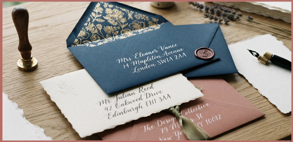
At its heart, envelope design is a conversation between appearance and function. You want the envelope to catch the eye, but the Recipient Address must remain easy to read, the Return Address should be positioned sensibly, and the Postage needs to be placed where it can be processed without trouble.
For personal correspondence, a little creativity can go a long way. A soft illustration, an unusual monogram, or a charming handwritten detail may turn an ordinary piece of mail into something that feels almost like a keepsake.
For businesses, the same principle works in a more restrained way. Strong Branding, consistent Brand Identity, and a clean Business Logo can make an envelope look professional without making it feel cold or overly corporate.
The nicest designs usually have one memorable detail, not twelve competing ones. A small floral corner, elegant lettering, or carefully chosen paper can sometimes do more work than a crowded collection of graphics.
Understanding Standard Envelope Sizes
Before choosing artwork or fonts, it helps to understand Standard Envelope Sizes. An envelope that looks gorgeous on screen can become a headache if the finished dimensions do not suit the contents or mailing requirements.
An envelope size chart is useful when planning invitations, cards, documents, or business mail. Different countries and postal systems can also have slightly different conventions, so always check the relevant Postal Regulations before producing a large batch.
Common Envelope Formats
The #10 Envelope is one of the familiar choices for business correspondence. It is commonly used for letters, invoices, statements, and everyday office mail, making it a practical option when you need a traditional business envelope.
A DL Envelope is another popular format, especially for letters and folded documents. Its long, narrow shape works nicely with a sheet of A4 Paper folded into thirds, although the exact folding arrangement should be tested before printing a full batch.
A C6 Envelope is smaller and is often associated with greeting cards, invitations, and personal notes. The C6 envelope size gives a compact, friendly appearance that works especially well for colorful or decorative stationery.
A C5 Envelope provides more room and is useful for A4 sheets folded once. It can also be a lovely choice for formal invitations where you want the envelope to have a little more visual presence.
The C4 Envelope is designed for larger documents and can generally accommodate A4 material without folding. It is particularly useful for reports, certificates, contracts, and professional documents where creasing the contents would be less desirable.
An A-2 Envelope is commonly associated with greeting cards and stationery in the United States. Its proportions can create a very attractive presentation for small notes, thank-you cards, and personal announcements.
A Booklet Envelope usually opens along the long side and is useful when the contents are thicker or more substantial. These are practical for booklets, brochures, catalogs, and promotional materials.
A Catalog Envelope is similarly designed for larger or bulkier contents. Businesses often use catalog envelopes for documents, sales materials, reports, and other items that simply dont fit comfortably inside a standard letter envelope.
Choosing the Right Envelope Style
Envelope styles affect more than appearance; they also influence how the envelope opens and how much room it provides. Looking at different envelope styles before beginning the artwork can prevent awkward design decisions later.
A Contour Flap Envelope has a curved flap that gives the envelope a more decorative personality. It can be especially attractive for invitations, stationery, and luxury correspondence where a standard straight flap might feel a little plain.
A traditional commercial flap, meanwhile, can look clean and highly professional. For Business Mailings, simplicity often wins because recipients need to identify the sender and process the contents quickly.
Square and specialty envelopes can create a dramatic presentation, but unusual shapes may have different mailing requirements. So the prettier choice isnt always the easier choice for postage or postal handling.
Selecting Envelope Materials
Envelope Materials establish the physical character of your design. Paper can feel delicate, luxurious, rustic, modern, or wonderfully ordinary, depending on its weight and finish.
Paper Stock is one of the first things to consider. A lightweight stock can work well for everyday correspondence, while heavier stock may be better suited to wedding invitations, premium stationery, or special announcements.
Paper Weight also affects printing and folding. Common options such as 24 lb Paper, 28 lb Paper, and 32 lb Paper offer different balances of flexibility, durability, and perceived quality.
For a classic office envelope, 24 lb paper may be perfectly practical. A heavier 28 lb or 32 lb option can give personal stationery or branded correspondence a sturdier feel, though compatibility with your printer should be checked first.
Textured Paper can add a tactile quality that photographs dont fully capture. Linen-like or softly textured surfaces often work beautifully with elegant invitations and handwritten-style designs.
Glossy Paper creates a polished appearance, but it isnt always the easiest surface for handwriting or every type of ink. If addresses will be written by hand, test the surface first, otherwise smudging can become an annoying surprise.
Sustainability can also be part of the design. FSC Certified Paper, Recycled Paper, and other Eco-Friendly Materials can support a thoughtful stationery identity without sacrificing visual appeal.
Typography: Making Words Look Beautiful and Readable
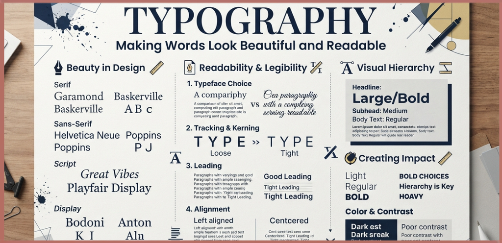
Typography is where many envelope designs quietly succeed or fail. A gorgeous font is useless if the recipient cannot read the address from a normal distance.
When choosing Fonts, think about the mood of the envelope. Serif fonts can feel traditional and formal, while clean sans-serif styles often create a contemporary appearance. Script fonts can be lovely for names, but they should be used with some restraint.
Digital Fonts are useful when you want consistency across hundreds of envelopes. They are especially practical for business correspondence because names and addresses can be produced clearly and quickly.
A Handwritten Address gives personal mail a warmer quality. For a wedding invitation, birthday greeting, or baby announcement, handwritten addressing can make the recipient feel that somebody actually spent time preparing the envelope rather than simply pressing print.
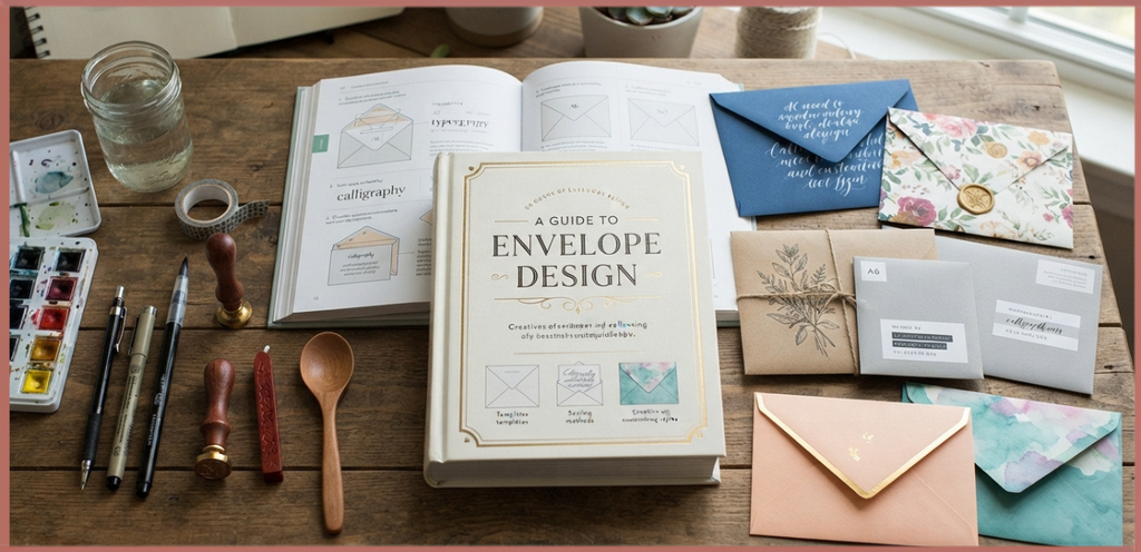
Calligraphy can make an envelope feel ceremonial, almost like it arrived from another little era. It works beautifully with weddings, anniversaries, formal invitations, and special family announcements.
However, decorative lettering should never interfere with Readability. The recipient address is ultimately a piece of functional information, and no amount of artistic charm makes an unreadable address useful.
Choosing Text Color and Contrast
Text Color should work comfortably against the envelope background. Pale gray lettering on cream paper may look elegant in a design program, but in real life it can become surprisingly difficult to read.
Color Contrast is therefore both a design and usability decision. Dark lettering on a light background is generally easier to process, while stronger contrast can help when envelopes are handled by a busy Mail Carrier.
An envelope color scheme can still be playful. Baby announcement envelopes might use soft neutrals with a tiny pink accent, while a business envelope could use company colors in a controlled way.
Try not to cover every available space with color. Sometimes a white envelope with one carefully chosen ink color looks far more sophisticated than a rainbow of competing elements, and its cheaper to print too.
Branding and Professional Envelope Design
For companies, an envelope is part of the wider identity of the organization. Consistent envelope branding helps connect physical mail with websites, packaging, invoices, and other branded stationery.
A Business Logo usually works best when it has enough breathing room around it. Squeezing a logo into a corner because there is technically some space there can make even a strong brand look cramped.
Brand Identity can also be communicated through typography, paper quality, spacing, and color rather than through a giant logo. A premium financial firm, for example, might use understated typography and heavier paper instead of loud graphics.
For Business Correspondence, consider using a restrained layout for routine letters, Statements, and Invoices. For promotional mail or Catalogs, you can allow more visual creativity because the envelope itself may be part of the marketing experience.
Personalized Envelope Design for Special Occasions
A Personalized Envelope is particularly effective when the event has emotional meaning. The envelope can quietly introduce the mood before the recipient sees the invitation, card, or announcement.
For a Wedding Invitation, consider elegant lettering, a subtle monogram, a crest, or a custom illustration that echoes the design of the invitation itself. The goal is continuity, so the outside and inside feel like two parts of one little story.
For an Anniversary, a simple monogram or meaningful date can be enough. You dont necessarily need elaborate artwork when one personal detail already carries emotional weight.
A Greeting Card can be paired with a colorful envelope, a small illustration, or an unusual flap style. The result can feel cheerful before the card is even opened.
For Invitations, the envelope may set expectations about whether the event is formal, casual, playful, traditional, or modern. Paper texture and typography are especially useful here because they communicate atmosphere without needing a long explanation.
Baby Announcement Envelope Ideas
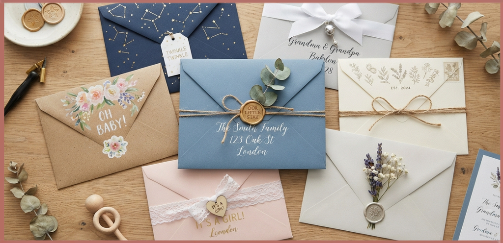
Welcoming a daughter into a family is one of those occasions where even ordinary stationery can suddenly feel important. A Baby Announcement envelope can be soft and joyful without becoming overly decorated.
A small floral motif, delicate stars, a custom illustration, or a simple name treatment can create a sweet first impression. Families with different traditions and backgrounds can also incorporate meaningful symbols that feel personal rather than generic.
Some families send printed announcements, while others prefer a photograph tucked inside. Either approach can work beautifully if the envelope design remains clear and balanced.
Here are some warm message ideas that can accompany the announcement, while the envelope itself carries the visual mood:
- “A little girl has arrived, and our hearts have found a brand-new rhythm.”
- “Tiny fingers, sleepy eyes, and a whole lot of love are heading your way.”
- “Our family has grown by one beautiful little heartbeat.”
- “Please welcome the sweetest new chapter in our family story.”
- “She arrived quietly, then somehow filled every corner of our world.”
- “A daughter has joined our family, bringing more joy than we knew how to hold.”
- “Little hands, big dreams, and a lifetime of love ahead.”
- “Our hearts are happily crowded now, thanks to one tiny girl.”
- “The smallest arrival has made the biggest change in our home.”
- “With grateful hearts, we are delighted to introduce our baby girl.”
Floral Graphics, Illustrations, and Graphic Elements
Floral Graphics are popular because they can communicate softness without requiring much space. Small leaves around a name or a tiny botanical corner can be enough to make a plain envelope feel intentional.
Custom Illustration takes personalization one step further. You might use a simple family-inspired drawing, a house illustration, a local flower, or another symbol connected to the recipient or occasion.
Other Graphic Elements should have a reason to exist. Borders, tiny stars, decorative dots, seals, and icons can support the composition, but adding them merely because the page looks empty usually makes the design busier rather than better.
For a modern look, try one illustration and one strong typeface. For a traditional look, pair calligraphy with a small crest or botanical drawing, but leave plenty of breathing room around both.
Monograms, Crests, and Personal Details
A Monogram is a surprisingly powerful design element because it can make a simple envelope immediately feel personal. Initials can be centered on a flap, placed in a corner, or used as a subtle repeating detail.
A Crest can create a formal appearance for weddings, family events, organizations, or ceremonial correspondence. It should, however, remain proportionate to the envelope instead of becoming the entire design.
For personal mail, even the smallest meaningful detail can work. A favorite flower, a shared initial, or a tiny illustration can tell the recipient, “this was made with you in mind,” and that feeling is hard to manufacture.
Address Placement and Postal Guidelines
Creative envelope design still has to obey practical rules. Address Placement should leave enough room for postal processing, and the Recipient Address needs to be clear and properly formatted.
The Return Address is generally placed in a designated area away from the recipient information. Exact requirements vary by postal authority, so checking current Postal Guidelines before sending unusual or heavily decorated envelopes is a smart move.
Postal Regulations can also affect the use of oversized, unusually shaped, or heavily embellished envelopes. A decorative envelope may require different postage or special handling depending on its final dimensions and characteristics.
Keep important address information away from decorative artwork. A beautiful floral graphic crossing through the ZIP or postal code might look artistic, but it isnt doing the envelope any favors.
Creating an Envelope Layout
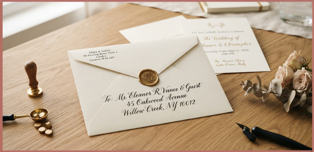
An effective envelope layout begins with zones rather than decoration. Think of the envelope as a small canvas with areas reserved for the return address, recipient information, postage, logo, artwork, and breathing space.
Start with the envelope dimensions, then establish the main visual area. From there, decide where the largest element should sit, usually the recipient address or a meaningful central design feature.
An Envelope Template can make this process easier, especially if you need to produce many envelopes. Templates reduce guesswork around flap areas, folds, margins, and printable zones.
A print-ready envelope should always be checked at its actual dimensions. What looks balanced on a large monitor can appear strangely crowded when reduced to a physical envelope, which is one of those design surprises nobody orders intentionally.
Envelope Design Software and Templates
You can create envelope artwork with many different layout tools depending on your experience. A simple Drag-and-Drop Editor may be enough for personal stationery, while more advanced software can offer precise control over typography, graphics, and print specifications.
Programs such as Swift Publisher can be useful for stationery and printable layouts, particularly when you want to work from existing templates and adjust text or artwork.
Pre-made Envelope Templates are helpful for beginners because they provide a starting structure. You can then change fonts, graphics, colors, and spacing instead of beginning with an entirely blank page.
The best envelope design software is not necessarily the most complicated one. Choose a tool that lets you accurately control the size, margins, artwork placement, and export settings you actually need.
Printing at Home vs. Professional Printing
Home Printer printing can be perfectly suitable for small personal projects. A few baby announcements or greeting card envelopes can often be produced economically at home, provided the printer supports the envelope stock and dimensions.
Before a full print run, perform a test. Check whether the ink smears, whether the printer feeds the envelope straight, and whether artwork lands where you expect it to land.
A Printing Service becomes more attractive for large quantities or premium projects. Professional printers can often handle heavier paper, specialized finishes, and larger production runs with greater consistency.
Professional Printing is particularly useful for branded stationery and formal invitations where alignment and color consistency matter. Still, even a professional printer needs a clear, correctly prepared file, so design quality starts before the file leaves your computer.
Envelope Assembly: The Often-Ignored Final Step
After printing comes Assembly, and this stage deserves more attention than it usually gets. A beautifully printed envelope can be ruined by crooked folds, excess adhesive, or flap edges that dont line up.
A Scored Fold helps create cleaner, more predictable folds. If youre making handmade envelopes, scoring before folding can produce a much more polished result.
For small projects, a Glue Stick may be convenient and relatively tidy. Double-Sided Tape can provide a cleaner bond for some specialty papers, especially when you want to avoid visible wet adhesive.
Test your adhesive on a spare envelope first. Some papers absorb glue differently, and glossy or textured surfaces may behave in unexpected ways, so testing is worth the tiny bit of extra time.
Envelope Design for Business Mail
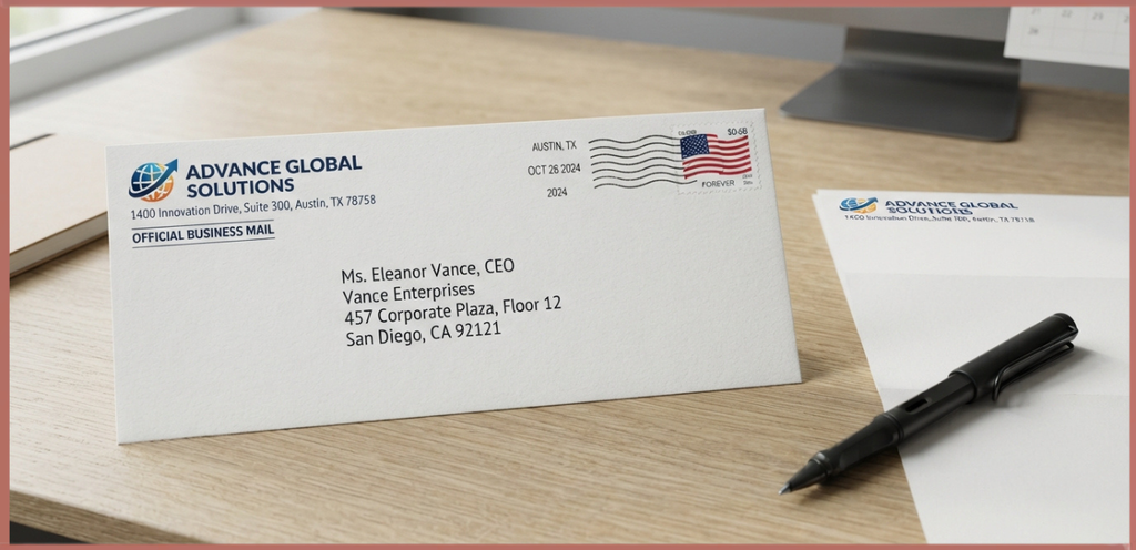
Business mail has a different personality from personal correspondence. A professional envelope should quickly communicate who sent it while maintaining a clear, organized appearance.
For invoices, statements, and documents, practical formatting is usually more valuable than decorative artwork. The recipient needs to understand the sender and process the mail quickly.
For Business Mail, consistent envelope formatting can also strengthen office stationery. Matching the envelope with letterheads, invoices, folders, and other materials creates a coherent visual system.
For promotional Catalogs, however, the envelope can become more expressive. A short phrase, bold graphic, or carefully designed teaser can encourage the recipient to open the mail instead of sending it straight toward the recycling bin.
Creative Ways to Deliver Personal Wishes
Sometimes the envelope itself can become part of the message. A personalized stationery set might use matching artwork across the envelope and card, making the complete package feel deliberately connected.
For a new baby, you could use a small floral illustration on the front and place the baby’s initials on the flap. For a birthday, a tiny illustrated symbol related to the person’s hobby can be much more touching than generic decoration.
For Holiday Cards, playful typography and seasonal illustrations can create a cheerful first impression. For a Charity Event, clean branding and a strong call-to-action can make the envelope both attractive and useful.
The trick is personalization without clutter. One meaningful detail often beats a dozen generic decorations, honestly.
How to Write a Custom Envelope Design Brief
Before designing, write down the purpose of the envelope in one sentence. For example: “This envelope is for a formal wedding invitation,” or “This envelope announces the arrival of our baby girl.”
Next, define the audience and emotional tone. Should it feel elegant, joyful, professional, traditional, playful, warm, or modern? Having this decision early makes later choices much easier.
Then choose the size, material, color, typography, artwork, and printing method. This simple Layout Design process prevents you from choosing a beautiful paper or font that later turns out to be impractical.
Finally, create a test version. Look at it in natural light, print it at real size, and imagine seeing it among a pile of ordinary mail. If it still catches your attention, youve probably got something working.
A Simple Checklist for Better Envelope Design
Before sending your finished envelopes, take a quiet minute to inspect the practical details. This little check can save a whole batch of envelopes from becoming expensive decorative mistakes.
- Confirm the Envelope Dimensions are suitable for the contents.
- Check that the Recipient Address is readable.
- Verify the Return Address placement.
- Leave appropriate room for Postage.
- Make sure important text has strong Color Contrast.
- Check spelling carefully, especially names and addresses.
- Test the chosen Paper Stock in your printer.
- Inspect ink quality and alignment.
- Confirm decorative elements dont interfere with postal information.
- Test the folding and Envelope Assembly.
- Make sure adhesive holds without damaging the paper.
- Review the final envelope under normal lighting rather than only on screen.
Frequently Asked Question
envelope design rules
Follow basic envelope design rules by keeping the address clear, leaving enough white space, and placing the return address and postage in their proper positions for easy mail processing.
envelope sizing
Envelope sizing depends on the document dimensions and mailing purpose. Choosing the correct size helps protect the contents and ensures a professional appearance.
envelopes size
Envelope sizes come in a variety of standard formats, including commercial, announcement, and catalog envelopes, each designed for specific paper sizes and uses.
envelope designer
An envelope designer helps create custom envelopes by arranging logos, colors, fonts, and address layouts while ensuring the design meets postal guidelines.
different envelope sizes
Different envelope sizes are suitable for letters, invitations, brochures, catalogs, and business documents, making it easy to match the envelope to its contents.
Read this blog https://avenzorixy.com/necklace-lengths-cm/
Final Thoughts on Envelope Design
Great Envelope Design is a quiet form of communication. It doesnt need to shout, because the right combination of paper, typography, spacing, color, and illustration can say plenty before the envelope is opened.
Whether youre preparing a Baby Announcement, wedding invitation, business mailing, greeting card, or personal letter, remember that the envelope is the first chapter of the message.
A thoughtfully chosen envelope template, suitable material, readable typography, and carefully planned artwork can transform an ordinary piece of mail into something genuinely memorable.
And when the envelope carries news about a new baby girl, that small piece of paper can feel even more precious. Somewhere between the return address and the little illustration, there is a whole family beginning a new chapter, and thats a lovely thing for an envelope to quietly introduce.
If youre designing one today, dont worry about making it perfect in every possible way. Make it meaningful, make it readable, and give it one detail that belongs unmistakably to the person receiving it. Thats often where the real beauty of custom envelope design lives.
If you have a favorite envelope style, a clever baby announcement idea, or a memorable piece of mail youve received, share your experience in the comments. Sometimes the best design ideas dont come from a template at all, they come from the little things people remember.